How to Paint 3D Models for Product Pages: Texture Painting Steps That Survive the Web

Your merchandiser opens a freshly modelled sideboard and sees walnut that looks like beige plastic. A colleague suggests painting in the grain highlights by hand, but that is the wrong fix: how you paint a 3D model for product use determines whether it holds up under any light or only from one angle. The model looks better from directly ahead. The moment anyone rotates it, or drops it into an AR view, the painted shadows sit in the wrong place and the whole thing reads as fake.
That is the core problem with how to paint 3D models for product use: hand-painting light and shadow into the colour channel looks convincing from one angle and breaks everywhere else. Separating colour, roughness, metalness and surface detail into four physically based rendering (PBR) maps holds up from every angle, under any light, and in AR on a customer's phone.
This post covers the digital PBR route for product brands. If you are here for painting resin miniatures or priming a 3D-printed part, the process is different, search for hobby painting guides. What follows is for furniture, laminates, doors, cabinetry and anything else that needs to look like the real thing on a product page.
Decide what you are actually painting
The phrase "painting a 3D model" means two completely different things depending on context.
For physical objects, printed parts, scale models, miniatures, you are applying real paint to a real surface, and the light that hits it is real. Your eye reads it correctly because physics handles the shading.
For a digital product model, there is no real light until a renderer applies it. If you paint the appearance of light directly onto the colour texture, you are freezing one lighting condition into the surface. Every other condition exposes the lie.
PBR painting solves this by describing the material properties of a surface rather than its appearance under a specific light. The renderer does the rest, and it does it correctly whether the customer is viewing on a grey background, a lifestyle scene, or their living room through AR.
Before you start, you need two things: a UV-unwrapped model with no overlapping islands, and a physical reference sample of the actual finish, a door swatch, a laminate chip, a steel panel. Without the reference, you are guessing.
Step by step: from reference sample to four texture maps
1. Photograph or scan the real finish.
Shoot the reference sample under flat, diffuse light, overcast daylight or a softbox, never direct sun. You want to capture the colour and surface character with as little directional shadow as possible. For wood grain and fabric weaves, a flatbed scanner often gives cleaner results than a phone camera. This image becomes the foundation for your base colour map. A full capture protocol is covered in this guide to photographing a product for 3D models.
2. Unwrap and set texel density.
Open the model in your texturing application and check the UV layout. Every face needs adequate, non-overlapping UV space. Set texel density consistently across the model so the grain or pattern does not appear larger on the door panel than on the drawer face. Stretched UVs are one of the most common reasons a product model looks wrong even after careful painting.
3. Paint the base colour map, with no shadows.
This is the step most painters get wrong. The base colour (sometimes called albedo or diffuse) must contain only the colour and pattern of the surface, no ambient occlusion, no highlights, no shadows. For wood and laminate, tile a tileable version of your scanned finish across the UV islands rather than painting each plank individually. Tiling materials keep seams invisible and scale correctly when the customer zooms in.
4. Build the roughness map.
Roughness controls how sharp or blurred reflections appear. A value near 0 gives a mirror finish; near 1 gives a completely matte surface. Brushed steel sits around 0.3 to 0.5 depending on direction. Matte laminate sits around 0.7 to 0.85. Painted oak will vary across the surface, the grain valleys are rougher than the raised fibres. Paint this variation in greyscale; it is one of the fastest ways to make a surface read as physically real rather than plastic.
5. Build the metalness map.
For most furniture and cabinetry, this is simple: metal hardware is white (value 1), everything else is black (value 0). Do not use intermediate values for non-metals, it produces a muddy result that no physical material actually matches.
6. Build the normal or bump map.
The normal map encodes surface micro-geometry, the depth of grain, the texture of a powder coat, the weave of a fabric, without adding polygons. Generate it from the scanned reference image using the height-to-normal conversion in your texturing tool. Check it at several zoom levels; over-amplified normals make a flat panel look like hammered metal.
7. Validate under neutral lighting.
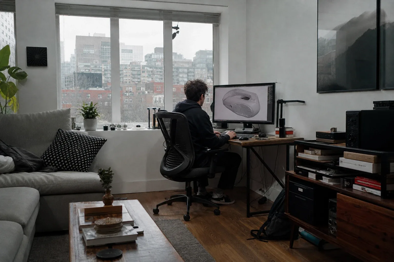
Before you call the maps done, view the assembled material under a plain grey environment with a single neutral light. PBR tools that offer instant switching between modelling and rendering modes make this fast, you can confirm the material reads correctly without exporting. Shapr3d Fix anything that looks wrong here rather than after export.
Test the paint the way a shopper will see it
A material that passes the neutral-lighting test still needs to survive the conditions your customers actually use.
Load the model into a web viewer and cycle through at least three lighting environments: a bright daylight interior, a warm evening interior, and a studio grey. If the walnut finish looks correct in all three, the maps are working. If it shifts colour or loses its grain character under one of them, the base colour still has baked lighting hiding in it.
Then test in AR. Drop the model into a real room and hold it next to the physical sample. Colour shift between the screen and the sample usually points to a colour space error, most web viewers expect sRGB for base colour and linear for roughness and metalness. Check your export settings.
One practical advantage of getting the material right once: you can reuse the same maps across every colourway variant and every channel you publish to. Modelry A sideboard in four finishes does not need four separate texture sessions, swap the base colour and roughness, keep the normal, and you have a new variant in minutes. Name materials consistently (something like sideboard_walnut_natural rather than material_03) so your team can find and update them without archaeology.
What can go wrong
Baked-in shadows. The most common failure. If the base colour map contains any directional shading, it will look wrong under any light that does not match the bake. Strip it out and repaint from the flat reference photograph.
Stretched UVs. Visible as grain that runs at the wrong angle or pattern that is compressed on curved faces. Fix the UV unwrap before painting, patching it afterwards costs more time than doing it right first. The Why Your 3D Models Look Poor and How to Fix Them post covers UV errors in more detail.
Texture seams. Visible lines where UV islands meet. Use your texturing tool's seam-hiding brushes, or position seams on hidden edges, the underside of a shelf, the back of a leg.
Oversized maps that slow the page. A 4K base colour map on a bedside table is unnecessary and adds seconds to load time. Match map resolution to the model's display size and complexity. The web-prep guide covering glTF, Draco, KTX2 and poly budgets covers compression and format choices for web delivery.
Colour shift between screen and sample. Almost always a colour space issue. Confirm base colour is in sRGB and roughness/metalness maps are in linear before exporting.
Glossy plastic look. Usually roughness set too low, or a uniform roughness value across the whole surface. Real materials vary. Even a painted panel has slightly different roughness at edges, around hardware, and across the flat field. Paint that variation in and the plastic look disappears.
Getting the texture maps right is the part of the workflow that determines whether a customer trusts what they see. Everything else, lighting, camera, background, is working on top of the material. If the material is wrong, nothing else fixes it.
If you would rather skip the texture work entirely, explore Thridify's no-code 3D and AR platform at thridify.com and see how your product finishes look in 3D and AR.
Have questions or ready to get started?
Get in touch with Thridify