
How to Make 3D Furniture Look Photorealistic (And Why Most Of It Doesn't)
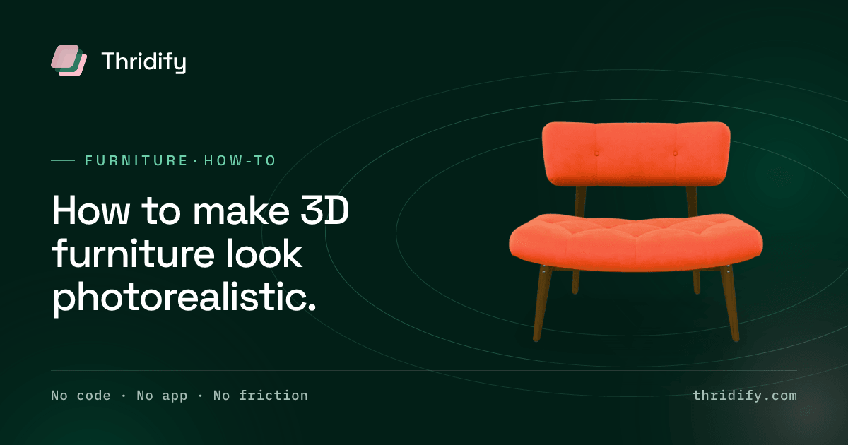
Put a 3D sofa next to a photograph of the same sofa and most people spot the fake in under a second. Ask them why and they will say something vague — "it looks CGI", "the fabric looks plasticky".
They are right, and they cannot articulate it, and that combination is the problem. You cannot fix a defect nobody can name. So here is the naming: photorealistic 3D furniture fails on four things, in roughly this order of frequency, and the rendering engine is not one of them.
1. Materials described as pictures instead of as surfaces
This is the big one.
The naive way to make wood is to wrap a photograph of wood around the geometry. It looks acceptable in the one lighting setup it was authored in and falls apart everywhere else, because a photograph of oak already contains the light from the day it was taken. Move your scene's light and the wood keeps its old highlights, which reads instantly as wrong even to someone who has never thought about rendering.
The correct approach is physically based rendering, where a material is described by how it responds to light rather than by what it looked like once:
- Base colour — the raw colour with all lighting removed. Flat, unlit, often disconcertingly dull on its own. That dullness is correct.
- Roughness — how scattered the reflection is. This single value is the difference between matte lacquer, satin and high gloss, and getting it wrong is what makes fabric look like plastic. Velvet is not "purple"; velvet is a specific roughness with directional sheen.
- Metalness — whether the surface is a metal. Near-binary in practice. Brushed brass legs and painted steel legs are different values, not different colours.
- Normal and bump detail — the micro-relief of weave, grain and brushed steel. This is what catches a grazing light and tells the eye the surface has texture rather than a picture of texture.
When a piece of 3D furniture looks "plasticky", roughness is almost always the culprit, and it is usually a single number away from correct.
2. Proportions that are approximately right
The second most common failure, and the most damaging, because it also breaks AR.
Furniture has conventions the eye knows without being taught. Seat height sits in a narrow band. Armrest thickness relative to seat depth. The taper on a leg. Get any of these subtly wrong and the piece reads as an imitation of furniture, even when the materials are excellent.
Model from the specification sheet, not from a photograph. A photograph has a lens in it, and a lens has perspective distortion that will walk your proportions somewhere plausible-looking and wrong.
This matters twice over if the model will be used in AR, because AR places objects at true real-world scale. A sofa that is 4% too tall looks fine in isolation and obviously wrong against a real doorway — and once a customer catches one thing that is wrong, they stop trusting everything else on the page.
3. Lighting from lamps instead of from a room
A render lit by a few point lights looks like a product lit by a few point lights, which is to say like a studio shot from 1998.
Real rooms light objects from every direction at once. A window is a large soft source; the wall opposite it is a dimmer source; the floor bounces warmth up into the underside of everything. Image-based lighting reproduces this by lighting the scene from an environment map — effectively a photograph of a real space wrapped around the scene — so reflections carry a plausible room in them and shadows have the softness of an actual window.
On glossy and metallic goods this is most of the perceived realism. A brass handle is convincing because you can almost make out a window in it.
Two details that repay attention: contact shadows, the darkening exactly where a leg meets the floor, without which furniture appears to hover; and ambient occlusion, the subtle darkening in crevices, under seat cushions and inside joints, which is doing quiet work in every photograph you have ever seen.
4. Detail spent in the wrong places
There is a fixed budget for geometric detail, because the file has to load on a phone. The skill is spending it where the eye goes.
Where it goes, on furniture: stitching and piping along cushion seams; edge profiles, because a perfectly sharp 90° edge does not exist in the physical world and the eye knows it — even a fraction of a millimetre of bevel catches light and reads as real; joint detail where a leg meets a frame; fabric behaviour, the slump of a cushion under its own weight, the fact that upholstery is never perfectly taut.
Where it does not go: the inside of a closed drawer, the underside of a fixed base, the back of a piece that stands against a wall.
Everything looking equally detailed is itself a tell. Real photographs have depth of field and falloff. Uniform crispness reads as synthetic.
The part everyone forgets: it has to load
A furniture model can be photoreal and still fail commercially, because the customer closed the tab before it arrived.
Two compression standards carry this. Draco compresses the geometry. KTX2 with Basis Universal supercompression compresses the textures, and stays compressed in GPU memory instead of expanding on arrival — which is the difference between a mid-range Android handling your product and stalling on it.
Texture resolution is the other lever, and it is usually over-specified. A 4K map on a component that occupies a fifth of the screen is invisible quality and very visible load time. Resolution should follow screen coverage.
Google's model-viewer documentation is a good practical reference for what a well-formed web asset looks like, and it is the same component family that renders these models in the browser.
A test that works better than opinion
Render the model at the same angle, focal length and lighting as an existing product photograph, and flip between the two at full size.
Differences that are invisible when you look at the render alone become obvious in the flip. Almost always the gap is one of the four above, and almost always it is materials.
Why this is worth the effort
The economics only work if the model is good enough to replace photography rather than supplement it. A convincing model renders every colourway, every room set and every marketing still without another studio booking — which is where the cost curve of a large catalogue actually inverts. A model that is nearly convincing gets used for the 3D viewer and quietly ignored by the marketing team, and you have paid for one thing and received half of it.
So the bar is not "good for 3D". The bar is that a customer cannot tell, and does not think to ask.
Related reading
- 3D product visualization — everything one model produces
- 3D modelling service — how the assets get built
- Furniture — what 3D changes for a furniture brand
- 360° product viewer