How to Build a Laminate and Veneer Visualiser (And Retire the Sample Box)
A laminate sample is A4. The kitchen is not A4.
That sentence is the whole problem. A surface chosen from a swatch is chosen at the wrong scale, in the wrong light, next to none of the things it will eventually sit beside. The customer approves a chip of walnut under a showroom spotlight and sees it again as forty square metres of wall under a north-facing window, and something has gone wrong that nobody can quite name.
No larger sample box fixes this, because the problem is not sample size. It is that a surface only means anything in context, and context is the one thing a chip cannot carry.
What a surface visualiser actually has to do
Three jobs, in order of how often they are skipped.
Show the material at room scale, so pattern repeat and grain direction read correctly. This is the whole point and the thing a swatch cannot do.
Show it in context — against the cabinetry, the worktop, the flooring and the hardware it will actually live with. Surfaces are never chosen in isolation and should never be shown in isolation.
Show it under different light. A high-gloss laminate and a matte one can be the same colour and completely different products depending on where the light comes from.
Everything below is in service of those three.
Texture work is the entire project
For most 3D projects, geometry is the hard part. For surfaces it is almost irrelevant — a worktop is a box. The difficulty is entirely in the material, and specifically in four things.
Scale calibration. Your texture must map to real-world dimensions. If a woodgrain repeats every 300 mm in reality, it must repeat every 300 mm in the visualiser. Get this wrong and the material is subtly, unplaceably fake at every size — the most common failure in surface visualisation, and the hardest for a non-specialist to diagnose.
Seamless tiling without visible repetition. A tile that repeats every 50 cm across a 4 m run produces a pattern the eye picks up immediately and cannot then un-see. Larger tiles, randomised offsets and variation maps all help. This is craft work, and it is where cheap surface libraries give themselves away.
Directional response. Brushed metals, textured laminates and open-pore veneers behave differently depending on the angle between the light, the surface and the viewer. A flat colour-plus-roughness material misses this, and misses exactly the quality that makes a premium surface feel premium in a showroom.
Honest gloss. Gloss level is a large part of what customers are choosing between, and it lives in the roughness value. This is the same discipline that decides whether 3D furniture reads as photoreal — and the reason so much surface visualisation looks like coloured plastic.
Veneers need something laminates do not
Laminate is a printed, repeating, controlled product. Veneer is a slice of a tree.
That difference has consequences your visualiser has to respect, or the product it shows is not the product you ship:
- Every leaf is different. A veneer visualiser that shows the same grain on every door is showing something that will never be delivered.
- Matching is a decision, not a detail. Book-matched, slip-matched and random-matched produce visibly different results from the same log, and customers who care about veneer care enormously about this. It should be a choice in the configurator, not an assumption.
- Grain direction is specified. Vertical on tall units, horizontal on drawer banks — a real specification decision that changes the look completely.
- Batch variation is real. Honesty here protects you. A visualiser that implies perfect uniformity is setting up a delivery-day conversation you do not want.
Handled properly, this is an argument for the visualiser rather than against it: it is the only practical way to show a customer what book-matching actually does before the log is cut.
Build the room, not the swatch
The single highest-leverage decision: put the surface on a configurable room scene, not on a floating panel.
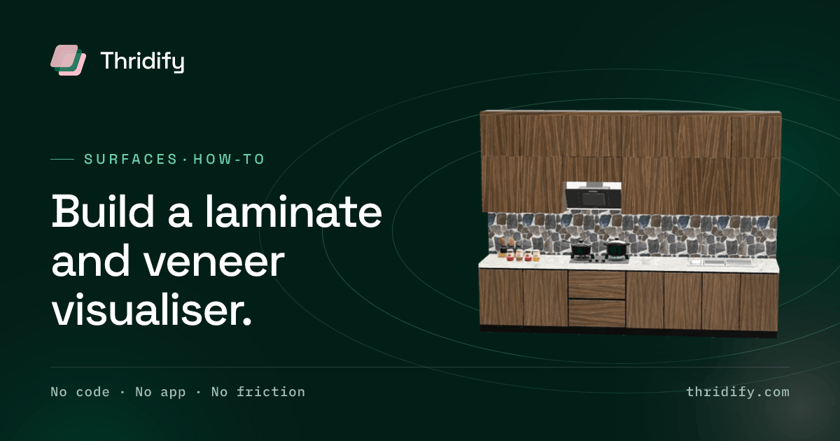
A kitchen scene with cabinet fronts, a worktop, a splashback and flooring — each independently changeable — lets the customer answer the question they actually have, which is never "what does this laminate look like" but always "what does this laminate look like with that worktop".
This is also where a surfaces business differs commercially from a furniture business. You are not selling one object; you are selling a component that has to harmonise. A visualiser that supports combination is selling the way the product is actually bought.
Practical notes: keep two or three scenes rather than one, because a bathroom and a kitchen read differently; let the customer change the lighting between daylight and evening, because that is a real objection you are pre-empting; and make sure a chosen combination can be saved and shared, because this decision is almost never made by one person alone.
The commercial case, which is about samples
For surfaces businesses the economics are unusually legible, and they sit in the sample programme.
Physical sampling is a real, recurring cost — production, warehousing, packing, postage, and the chips that go out and never convert. Every enquiry that arrives already narrowed from forty candidates to three is a saving, and a better conversation.
The visualiser does not remove physical samples, and should not. Nobody specifies a premium surface without touching it. What it removes is the first round — the speculative box of forty. The customer arrives at the sample request already confident about direction, and you post three chips instead of forty.
Add the AR step and it goes further: a customer can hold a phone against their own wall, in their own light, beside their own floor, before requesting anything at all.
What to build first
- Digitise ten surfaces properly, not the whole range. Correct scale calibration, seamless tiling, honest gloss. A badly-digitised range is worse than a small well-digitised one, because customers judge the product by the render.
- Build one room scene for your most common application.
- Make combination the primary interaction — change the worktop, change the flooring, change the light.
- Wire it to the sample request, carrying the chosen combination through.
- Measure sample-to-order conversion, not visualiser sessions. That ratio is where the money is, and it is the number that justifies digitising the remaining range.
Related reading
- Laminates & surfaces — the vertical in detail
- 3D product visualization
- How to make 3D furniture look photorealistic — the same material discipline
- AR product viewer